Modern web applications are complex ecosystems. They are not merely collections of files but interconnected systems where data moves between distinct logical boundaries. As systems grow, maintaining clarity becomes a significant challenge. Developers often find themselves navigating spaghetti code where the origin of a piece of data is unclear, and the destination is ambiguous. This lack of visibility leads to technical debt, fragile dependencies, and increased time spent on debugging.
This guide explores a practical approach to visualizing data flow across packages. By focusing on package diagrams, we establish a blueprint for understanding how information travels through the architecture. This process is essential for maintaining a healthy codebase, ensuring that changes in one area do not inadvertently break functionality in another. We will examine the methodology, the specific steps involved, and the long-term benefits of maintaining clear architectural documentation.
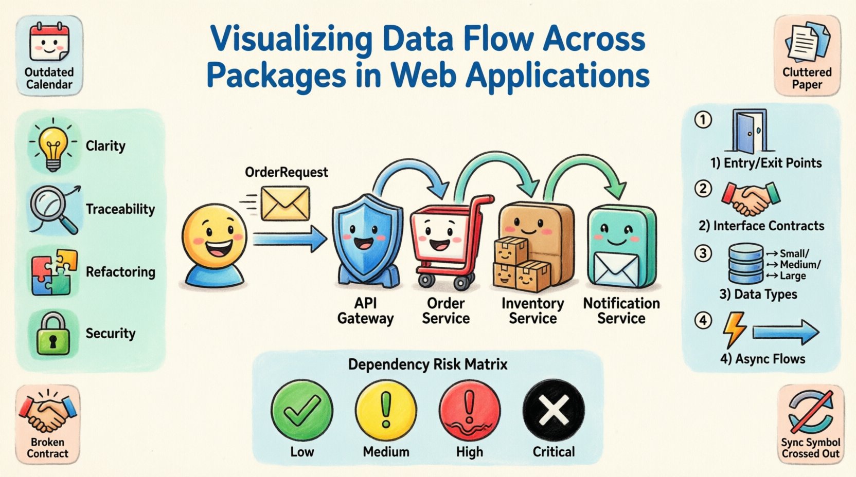
📐 Understanding Package Diagrams and Their Purpose
A package diagram is a structural diagram that shows the organization of a system into logical groups. In the context of a web application, a package often represents a specific domain, module, or service boundary. It is not just a folder structure; it is a representation of the system’s intent.
When we talk about visualizing data flow, we are moving beyond static structure. We are interested in the dynamic movement of information. Why is this distinction important?
- Clarity: It helps new team members understand how the system works without reading every line of code.
- Traceability: When an error occurs, you can trace the path of the data to identify the source.
- Refactoring: It allows you to see which components are tightly coupled before attempting to restructure them.
- Security: It highlights where sensitive data is transmitted and ensures it passes through necessary validation layers.
Without this visualization, developers often rely on mental models that may differ from the actual implementation. This discrepancy is a primary cause of regression bugs. A package diagram acts as the single source of truth for architectural relationships.
🎯 Defining the Scope for Visualization
Before drawing lines between boxes, you must define what constitutes a package. A package should not be too granular, nor should it be too broad. If a package contains only one class, it defeats the purpose of grouping. If a package contains everything, it offers no separation of concerns.
The scope of visualization should align with the deployment and logical boundaries of the application. Consider the following criteria when defining your packages:
- Domain Driven Design (DDD): Align packages with business domains, such as Order Management or User Authentication.
- Layering: Separate concerns into layers like Interface, Logic, and Data Access.
- Responsibility: Each package should have a single, well-defined responsibility.
- Independence: Packages should be able to change with minimal impact on others.
Defining this scope upfront prevents the diagram from becoming a tangled web. It ensures that the visualization remains useful as the application evolves.
🏗️ The Case Study Architecture
To illustrate the process, we will examine a hypothetical web application designed for an e-commerce platform. This scenario involves multiple functional areas that require data exchange. The architecture is divided into the following logical packages:
- Core Domain: Contains the fundamental business logic, entities, and value objects.
- API Gateway: Handles incoming requests, authentication, and routing.
- Inventory Service: Manages stock levels and product availability.
- Order Service: Processes transactions and creates order records.
- Notification Service: Sends emails and push alerts to users.
In this scenario, a user places an order. The data must flow from the API Gateway through the Order Service, interact with Inventory, and finally trigger a Notification. Visualizing this flow requires mapping the interfaces and dependencies between these packages.
🔄 Step-by-Step Visualization Process
Creating an accurate representation of data flow requires a methodical approach. It is not enough to draw boxes; you must annotate the connections with specific details about what data is moving.
1. Identify Entry and Exit Points
Every package must have defined boundaries. Identify where data enters the system and where it leaves. For the API Gateway, the entry point is the HTTP request. The exit point might be a database transaction or a message queue event. Mark these clearly on the diagram.
2. Map Interface Contracts
Dependencies should be defined by interfaces, not concrete implementations. When mapping the flow between the Order Service and the Inventory Service, specify the interface methods being called. This decouples the packages and makes the diagram more stable.
- Input: What data is required? (e.g.,
OrderRequest,UserId) - Output: What data is returned? (e.g.,
StockStatus,TransactionId) - Errors: How are failures communicated? (e.g.,
TimeoutException,InvalidDataError)
3. Annotate Data Types and Volume
Not all data flows are equal. Some are small metadata updates, while others are large file transfers. Annotating the type and volume of data helps in performance planning. For instance, the Notification Service might handle a high volume of small messages, whereas the Inventory Service might handle large batch updates.
4. Highlight Asynchronous Flows
Modern applications often rely on asynchronous communication. If the Order Service does not wait for the Inventory Service to respond immediately, this is a critical architectural detail. Distinguish between synchronous calls (blocking) and asynchronous events (fire-and-forget). Use different line styles to represent these interactions visually.
🔗 Analyzing Dependencies and Coupling
Once the diagram is drawn, the real work begins: analysis. You must look for signs of unhealthy coupling. Coupling refers to the degree of interdependence between software modules.
High coupling means a change in one package requires changes in another. This reduces flexibility and increases the risk of breaking changes. The goal is to achieve low coupling while maintaining high cohesion (where elements within a package are closely related).
During the review process, look for the following patterns:
- Circular Dependencies: Package A depends on B, and B depends on A. This creates a deadlock in compilation and logic.
- Hidden Coupling: Dependencies that exist only through shared static variables or global state.
- God Packages: A single package that depends on or is depended upon by almost everything else.
- Leaky Abstractions: Where implementation details of one package are exposed to another.
Dependency Risk Matrix
To assist in assessing the health of your architecture, use a risk matrix to categorize dependencies based on their impact.
| Dependency Type | Coupling Level | Risk Score | Recommended Action |
|---|---|---|---|
| Interface Dependency | Low | Low | Acceptable |
| Shared Library Dependency | Medium | Medium | Review regularly |
| Direct Class Dependency | High | High | Refactor to interface |
| Global State Dependency | Very High | Critical | Eliminate immediately |
| Circular Dependency | Blocked | Critical | Restructure architecture |
⚠️ Common Visualization Pitfalls
Even with a clear methodology, errors can occur during the documentation process. Being aware of common pitfalls helps maintain the accuracy of your diagrams.
- Outdated Diagrams: The most common issue is documentation that lags behind code. If the code changes and the diagram does not, the diagram becomes noise. Establish a rule that the diagram is part of the definition of done for any major feature.
- Over-Abstraction: Creating a diagram that is too high-level provides no actionable insight. Include enough detail to understand data types and flow direction.
- Under-Abstraction: Including every single method call clutters the view. Focus on the high-level flow and the critical path.
- Ignoring Data Contracts: Focusing only on control flow (who calls whom) without showing data flow (what is passed) renders the diagram less useful for debugging.
- Assuming Synchronous Flow: Many systems are event-driven. Assuming synchronous calls in a diagram can lead to misunderstandings about latency and reliability.
🛡️ Sustaining Architectural Integrity
Creating the diagram is only the first step. Maintaining it requires discipline. Architectural integrity is not a one-time task; it is a continuous process of verification and adjustment.
One effective strategy is to integrate diagram verification into the build pipeline. Automated tools can check that the code structure matches the documented dependencies. If a new dependency is introduced without updating the diagram, the build can fail or generate a warning. This forces developers to keep the documentation current.
Another strategy is regular architectural reviews. Schedule quarterly sessions where the team walks through the diagrams. Discuss recent changes and update the visualization to reflect the current state of the system. This ensures that the knowledge remains distributed across the team and not siloed in one person’s head.
🤝 Onboarding and Knowledge Transfer
One of the most valuable outcomes of a well-maintained package diagram is improved onboarding. When a new developer joins the team, they face a steep learning curve. They need to understand where the code lives and how it interacts.
A clear visualization reduces this time significantly. Instead of searching through thousands of files, a new hire can look at the diagram to understand the entry points. They can see where the data enters, how it transforms, and where it is stored.
- Reduced Context Switching: Developers spend less time figuring out the system and more time writing code.
- Faster Debugging: When an issue arises, the team can point to the diagram to hypothesize where the failure occurred.
- Better Collaboration: Different teams can work on different packages with confidence, knowing the boundaries are clear.
Documentation should not be static text. It should be a living artifact that evolves with the codebase. Treat the diagram as a critical component of the software, just like the code itself.
🚀 Final Thoughts on Data Visualization
Visualizing data flow across packages is a fundamental practice for any mature software engineering team. It transforms a chaotic collection of files into a structured, understandable system. By following a disciplined approach to creating and maintaining these diagrams, you reduce risk and improve the overall quality of the application.
The effort required to document these flows pays dividends in reduced maintenance time, fewer production incidents, and a more cohesive team. It is not about creating bureaucracy; it is about creating clarity. In an environment where complexity is inevitable, clarity is the most valuable asset you can possess.
Start by mapping your current architecture. Identify the packages, trace the data, and highlight the dependencies. You may find areas that need immediate attention. Use this insight to guide your refactoring efforts. Over time, the system will become more resilient and easier to extend. This is the path to sustainable software development.