


Planning a complex project like a new product launch can feel overwhelming. The Visual Paradigm Gantt Chart Builder is a powerful online tool that makes it easy to create a clear, visual timeline. This web-based software helps you define tasks, set start and end dates, track progress, and organize everything into a professional Gantt chart. It’s a simple, intuitive solution for project managers, team leaders, and anyone who needs to plan and communicate a project schedule. The tool features an interactive task editor and a live Gantt chart that updates instantly as you input data. You can customize the timeline, save your project locally as JSON, and export high-quality images for presentations. The entire process is seamless and requires no sign-up.
Key Takeaways
-
Use the Interactive Task Editor to define tasks, assign developers, and set dates.
-
See your project timeline update in real-time with the Live Gantt Chart Visualization.
-
Customize the chart’s appearance by adjusting the Timeline Properties like time unit and column width.
-
Save your work locally using the Local Save/Load & Export feature.
-
Export your finished chart as an image for presentations or reports.
What is the Gantt Chart Builder?
The Gantt Chart Builder is an online application designed to help you create and manage project timelines. It provides a structured way to plan, track, and communicate your project schedule. The tool combines a spreadsheet-like table for entering task data with a dynamic, visual Gantt chart that updates as you make changes. This allows you to get an instant overview of your project’s progress. The interface is clean and intuitive, making it easy to get started without any training. You can use it to plan anything from a marketing campaign to a complex software development project. The tool is completely web-based, so you can access it from any device with an internet connection.
How to Use the Gantt Chart Builder
Getting Started
To start, open the Gantt Chart Builder. You’ll see the interface divided into two main sections. The top section, Timeline Properties, lets you set the overall parameters for your chart. You can define the start and end dates of your project, choose the time unit (day, week, month, or year), and adjust the step interval. You can also customize the width of the columns in the chart. The middle section is the Task Data table, where you enter all your project tasks. Each task has a title, an assigned developer (represented by an avatar), a start date, an end date, and a progress percentage. The bottom section is the Live Preview, which displays your Gantt chart in real-time.
Creating a Project Plan
Let’s say you’re planning a marketing campaign for a new product launch. The first step is to add your tasks to the table. Click the Add Task button to create a new row. For each task, fill in the title, developer, start date, and end date. For example, you might have tasks like “Market Research & Competitor Analysis,” “Develop Marketing Strategy & Messaging,” and “Content Creation.” As you enter the dates, the Gantt chart will automatically update to show the task bars. You can also set the progress for each task. For instance, if the market research is complete, you would set its progress to 100%. The chart will show a filled bar for completed tasks and a partially filled bar for incomplete ones.
Customizing Your Chart
After you’ve entered your tasks, you can fine-tune the appearance of your Gantt chart. In the Timeline Properties section, you can adjust the time unit. If your project spans several months, you might choose “Month” as the unit. You can also change the step interval to show every other month or every three months. The Column Width slider lets you make the columns wider or narrower, which can help fit more detail on the screen or provide a broader overview. These adjustments are crucial for making your chart readable and effective.
Exporting Your Work
Once your Gantt chart is complete, you can export it for use in presentations or reports. Click the Export Image button to download a high-quality image of your chart. You can also export your raw project data as a JSON file, which is useful for backup or for importing into other systems. The tool allows you to save your project locally, so you can load it later and continue working on it. This is especially useful if you’re working on a long-term project and need to make updates over time.
Understanding the Interface
Looking at the provided images, you can see how the Gantt Chart Builder works. Image 1 shows the upper part of the screen, which includes the Timeline Properties and the Task Data table. The timeline properties are set for a project starting on November 18, 2025, and ending on March 11, 2026, with a time unit of “Week.” The task data table lists several tasks for a marketing campaign, including “Market Research & Competitor Analysis” and “Develop Marketing Strategy & Messaging.” Each task has a developer assigned, and the start and end dates are clearly defined. The progress for the first task is 100%, indicating it is complete.
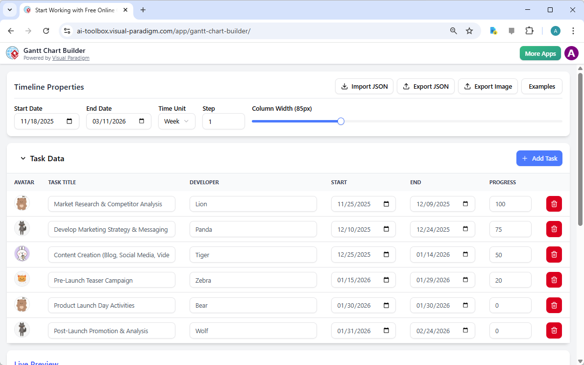
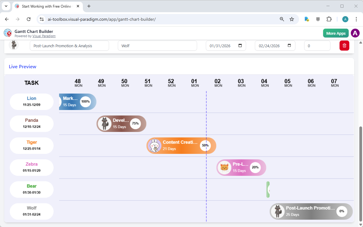
Image 2 shows the lower part of the screen, the Live Preview of the Gantt chart. This is where the visual magic happens. The chart displays the tasks from the table as horizontal bars, with the developer’s avatar on the left. The bars are color-coded to show the progress of each task. The first task, “Market Research & Competitor Analysis,” is fully completed and shown in blue. The second task, “Develop Marketing Strategy & Messaging,” is 75% complete and shown in brown. The third task, “Content Creation,” is 50% complete and shown in orange. The chart also includes a vertical line indicating the current date, which helps you see how far along the project is. This visual representation makes it easy to understand the project’s progress at a glance.
Who Can Benefit from the Gantt Chart Builder?
The Gantt Chart Builder is a versatile tool suitable for a wide range of users. Project managers can use it to create detailed project plans and track progress across teams. Team leaders can visualize workload and communicate schedules to their team members. Entrepreneurs and startups can plan product development roadmaps and marketing campaigns. Students can manage academic projects and study schedules. Anyone who needs to plan a project with a clear timeline can benefit from this tool. The ability to customize the chart and export it as an image makes it ideal for presentations and reports.
Conclusion
The Visual Paradigm Gantt Chart Builder is an excellent tool for anyone who needs to plan and visualize a project. Its intuitive interface, real-time updates, and customization options make it easy to create a professional Gantt chart. Whether you’re managing a complex project or just planning a personal task, this tool can help you stay organized and on track. The ability to save your work locally and export it as an image ensures that your project data is secure and easy to share. Try the Gantt Chart Builder today and see how it can simplify your project planning process.
Try the Gantt Chart Builder Now
Related Links
-
Pert Chart Tool – Visual Paradigm Online: Explore the powerful PERT chart tool in Visual Paradigm Online, designed to help project managers visualize task dependencies, estimate timelines, and manage project schedules effectively.
-
Pert Chart User Guide – Visual Paradigm: Detailed user documentation on how to create, edit, and utilize PERT charts within the Visual Paradigm software for robust project management.
-
Pert Chart Tutorial – Visual Paradigm Knowledge Base: An in-depth tutorial on PERT charts, covering their purpose, construction, and application in real-world project management scenarios.
-
Enhanced PERT Chart Features – Visual Paradigm: Discover advanced capabilities of Visual Paradigm’s PERT chart tool, including dynamic scheduling, critical path analysis, and integration with project timelines.
-
Visual Paradigm Gantt Chart Tool – Create & Manage Project Timelines: A powerful, web-based Gantt chart tool designed for project managers to plan, visualize, and track project timelines with ease.
-
Online Gantt Chart Tool – Real-Time Collaboration & Project Planning: Collaborate in real time with team members using Visual Paradigm’s cloud-based Gantt chart tool for efficient project planning and tracking.
-
Visual Paradigm Jira Integration: Seamless Diagramming and Agile Workflow: Discover how Visual Paradigm’s Jira integration enables teams to synchronize diagrams, models, and agile workflows directly within Jira for improved collaboration and project visibility.
-
Visual Paradigm – Agile User Story Mapping Tool: A comprehensive user story mapping tool designed to help agile teams visualize product backlogs, prioritize features, and plan sprints effectively.