In the landscape of software architecture, clarity often takes a backseat to the appearance of comprehensiveness. Many teams assume that a diagram must look dense to be useful. This is a misconception that hinders communication. When creating a UML Package Diagram, the goal is to show structure, not to demonstrate vocabulary knowledge. This guide explores why simplifying your notation leads to better outcomes for your team and your project.
🧩 The Purpose of a Package Diagram
A Package Diagram is a structural diagram used to visualize the organization of the system. It groups elements into packages to manage complexity. Unlike class diagrams that focus on attributes and methods, package diagrams focus on boundaries and dependencies. The primary function is to provide a high-level view of how components interact.
When you strip away unnecessary symbols, the core message becomes louder. Here is what a standard package diagram should achieve:
- Define logical boundaries within the system 📦
- Illustrate dependencies between groups
- Support navigation for developers reading the codebase
- Document the static structure for future reference
Complex notation often obscures these goals. Adding every possible relationship type creates noise. The audience needs to understand the flow, not the specific cardinality of every link.
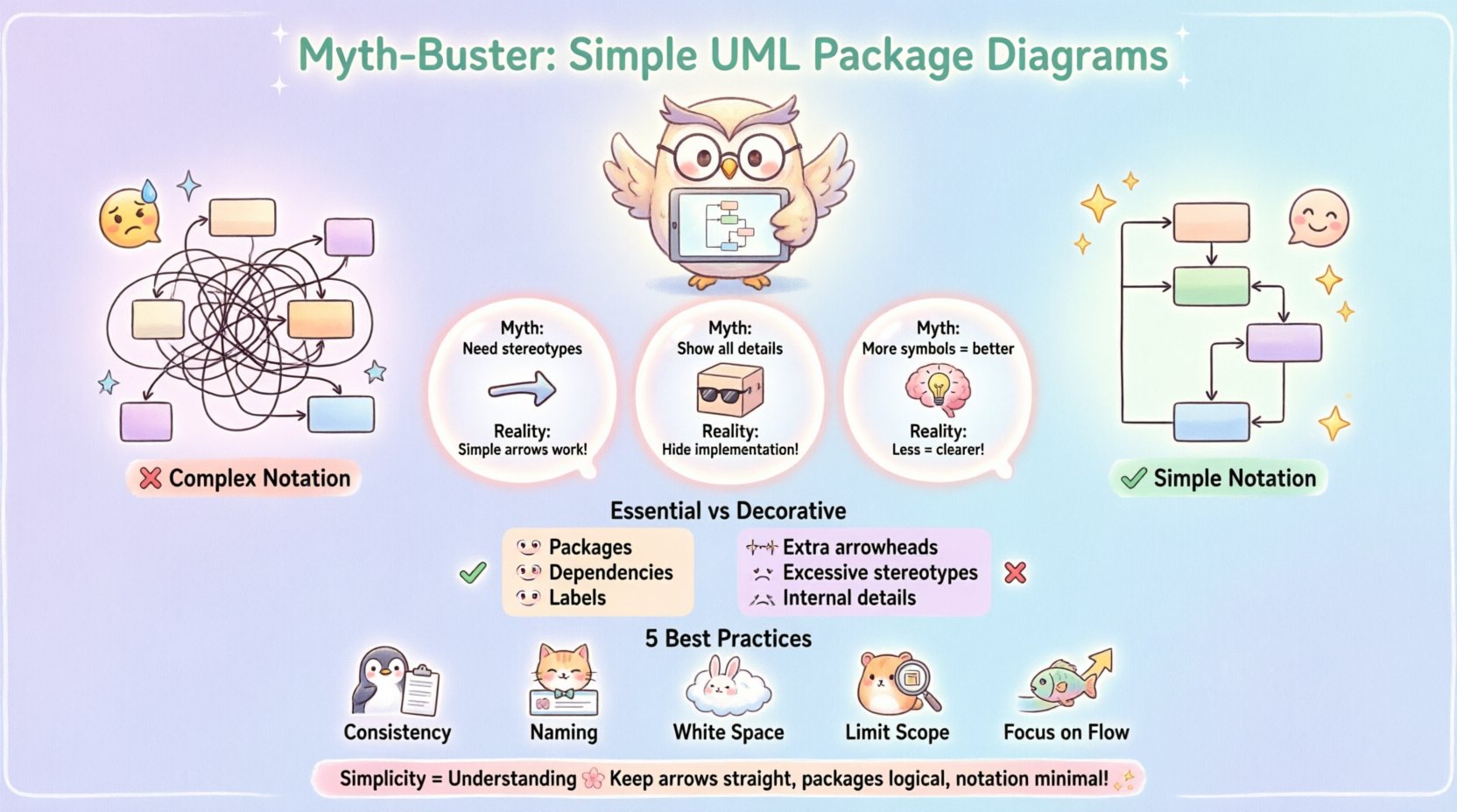
🤔 Why Complexity Persists (The Myth)
Why do engineers feel the need to add complexity? Often, it stems from a fear of being incomplete. There is a belief that leaving a relationship undefined implies it does not exist. This is not true. In architecture documentation, what is shown is what is relevant. What is omitted is either irrelevant or implied.
Consider the following common myths:
- Myth: Every relationship needs a specific stereotype.
Reality: A simple arrow often suffices for dependency. - Myth: Package diagrams must show internal class details.
Reality: That is a class diagram’s job. Packages hide implementation details. - Myth: More notation equals more precision.
Reality: More notation equals more cognitive load.
When you prioritize precision over clarity, you create documents that no one reads. A diagram that is too detailed becomes obsolete quickly. Changes in the code force constant updates to the diagram. A simple diagram survives longer because it represents the structure, not the implementation.
📏 Core Elements vs. Decorative Notation
To understand where to draw the line, we must distinguish between essential elements and decorative ones. Essential elements define the structural integrity of the diagram. Decorative elements attempt to add semantic weight that the viewer might not need.
Essential Elements
- Packages: The containers that group related elements. They represent modules, namespaces, or subsystems.
- Dependencies: The lines showing that one package uses another. This is the most critical relationship.
- Interfaces: Optional, but useful when showing contracts between packages.
- Labels: Clear text explaining the nature of the connection.
Decorative Elements
- Multiple Arrowheads: Using different line styles for the same type of dependency.
- Excessive Stereotypes: Adding tags like «<
>» or «< >» when the arrow direction implies the flow. - Internal Visibility: Drawing lines between individual classes inside a package when the package boundary is the focus.
- Complex Aggregations: Using full aggregation or composition symbols when a dependency arrow is sufficient.
The rule of thumb is simple. If a symbol adds information that cannot be inferred from the context, keep it. If it just looks technical, remove it.
📊 Notation Density vs. Readability
There is a direct correlation between the number of symbols on a page and the time it takes to understand the diagram. Let us look at a comparison of two approaches.
| Feature | Complex Notation | Simple Notation |
|---|---|---|
| Visual Clarity | Low. Lines intersect and clutter the view. | High. Clean lines and open space. |
| Maintenance Effort | High. Every change requires updating multiple symbols. | Low. Update the connection, keep the symbol. |
| Learning Curve | Steep. New team members must learn the legend. | Shallow. Standard arrows are universally understood. |
| Information Density | Low. Important data is lost in the noise. | High. Focus remains on the architecture. |
As shown in the table above, the simple approach wins in almost every metric that matters for long-term project health.
🔗 Managing Dependencies Without Over-Engineering
Dependencies are the lifeblood of a package diagram. They show how change propagates through the system. However, not all dependencies are equal. A direct class dependency is different from a high-level module dependency. You must choose the right level of abstraction.
When mapping dependencies, consider these guidelines:
- Use Solid Lines: Represent a standard dependency. This is the default choice.
- Use Dashed Lines: Reserve for specific cases like <
> or < > if your team agrees on a standard. Otherwise, stick to solid. - Label the Line: If the direction is obvious, do not label. If the direction is ambiguous, add text.
- Avoid Cycles: If you see a cycle in your packages, it indicates a coupling issue. Highlight this without adding extra symbols to hide it.
By keeping the notation consistent, you allow the reader to scan the diagram quickly. They do not need to look up what a specific arrow means every time they encounter it.
👥 Understanding Your Audience
The complexity of a diagram should match the needs of the person reading it. A diagram meant for a stakeholder differs from one meant for a developer. However, the principle of simplicity applies to both.
For Stakeholders
Stakeholders care about the big picture. They want to know if the system is modular, scalable, and maintainable. They do not care about the specific interface types. A simple package diagram shows them the boundaries and the flow of data.
- Focus on major subsystems.
- Use clear, descriptive names for packages.
- Keep the number of dependencies visible but not overwhelming.
For Developers
Developers need to know how to integrate their code. They need to know which packages they can import. They need to know the contracts. Even here, complex notation is a distraction.
- Show which packages are required for the current module.
- Indicate public vs. internal packages if necessary, but keep it simple.
- Ensure the diagram matches the actual file structure.
When the diagram serves the audience, it earns its place in the repository. When it serves the creator, it becomes a burden.
🛠 Maintenance and Evolution
A diagram is a living document. It must evolve as the code evolves. Complex notation makes this evolution difficult. Every time a relationship changes, you might need to update a stereotype or a line style. This increases the chance of the diagram becoming outdated.
Simple notation reduces the friction of updates. If you only use arrows, you only need to draw lines. This encourages you to keep the diagram current. A current diagram is more valuable than a perfect diagram that is three months old.
Consider these maintenance strategies:
- Review Cycle: Schedule periodic reviews to ensure the diagram matches the code.
- Automate where possible: Some tools can generate diagrams from code. Use this to verify the structure.
- Version Control: Treat the diagram file like code. Commit changes with messages explaining the structural shift.
- Keep it Abstract: Do not document every single dependency. Document the logical boundaries.
🚫 Common Pitfalls to Avoid
Even with the best intentions, it is easy to slip into complexity. Be aware of these common traps.
- Overlapping Packages: Avoid packages that share elements unless there is a clear reason. This creates confusion about ownership.
- Deep Nesting: Do not nest packages more than three levels deep. It becomes hard to see the top-level structure.
- Unclear Labels: If a label says “Connection”, it is useless. Be specific about the type of interaction.
- Ignoring Visibility: While you do not need class-level visibility, you should respect package-level visibility. Do not draw lines from external packages to internal classes.
- Redundant Layers: Do not create a “Manager” package just to hold other packages. If it adds no logical grouping, remove it.
💡 Best Practices for Clarity
To ensure your diagrams remain effective over time, adhere to these core principles.
- Consistency is King: Once you decide on a symbol for dependency, use it everywhere.
- Naming Conventions: Use a standard naming convention for packages. This helps searchability.
- White Space: Use white space to group related packages. Visual proximity implies relationship.
- Limit Scope: Do not try to diagram the entire enterprise in one view. Break it down into subsystems.
- Focus on Flow: Show how data moves from one package to another. This is the most valuable insight for developers.
🔄 Iterative Design Process
Start with a blank canvas and add packages as you understand the system. Do not plan the entire diagram before writing the first line of code. This is a dynamic process.
- Identify Boundaries: Group classes by functionality.
- Draw Packages: Create boxes for these groups.
- Add Connections: Draw lines where one group uses another.
- Review: Ask if the diagram makes sense without the legend.
- Refine: Remove lines that do not add value.
This iterative approach ensures the diagram grows with the project. It prevents the creation of a “big bang” diagram that is too complex to maintain.
🎯 Final Thoughts on Simplicity
The value of a UML Package Diagram lies in its ability to communicate structure. It is a tool for thought, not a checklist for completeness. When you choose simplicity, you choose clarity. You choose a document that your team will actually use. You choose a standard that will survive the changes of the future.
Remember that the goal is understanding, not decoration. By stripping away the unnecessary, you reveal the essential. This is the path to effective documentation. Keep your arrows straight, your packages logical, and your notation minimal. This approach builds a foundation for better software architecture.
Start today. Look at your current diagrams. Remove the stereotypes. Remove the extra lines. See if the message remains. It will. That is the power of simplicity.