Use Case Diagrams serve as a foundational blueprint for understanding system behavior and user interactions. They bridge the gap between abstract requirements and concrete system functionality. However, the path from concept to diagram often contains hidden traps. Poor design choices can lead to miscommunication, scope creep, and development errors. This guide details the structural and semantic errors that frequently occur during the modeling phase.
🤔 Understanding the Purpose of Use Case Modeling
Before diving into errors, it is essential to reaffirm the intent of a Use Case Diagram. The diagram captures functional requirements from the perspective of an external observer. It answers the question: “What can the system do?” for a specific user or actor. It is not a flowchart, nor is it a state machine. It focuses on the interaction between the system boundary and the actors.
When designers lose sight of this purpose, the diagram becomes cluttered and unhelpful. The goal is clarity, not completeness of every single click. A well-structured diagram acts as a communication tool for stakeholders, developers, and testers. It ensures everyone agrees on the system’s scope before a single line of code is written.
👥 Mistake 1: Confusing Actors with User Roles
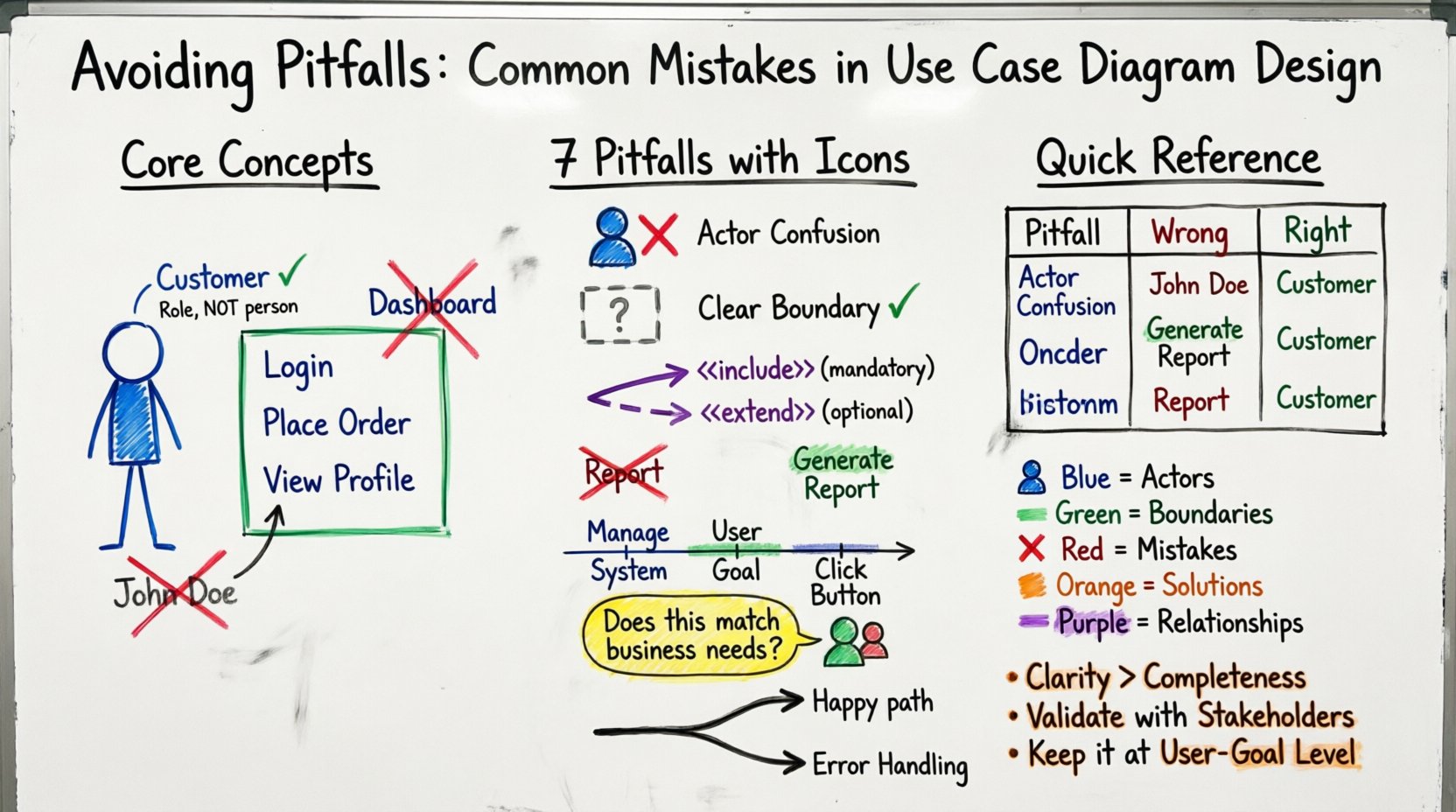
One of the most pervasive errors involves the definition of an Actor. An Actor represents a role played by an entity that interacts with the system. This entity can be a human, an external system, or a hardware device. It is not a specific person or a software tool.
- Human vs. Role: Do not label an actor as “John Doe.” Instead, use the role, such as “Customer” or “Administrator.” Roles define the permissions and interactions required, not the individual identity.
- External Systems: Developers often forget that external services act as actors. If the system sends data to a payment gateway, that gateway is an external actor. It initiates or receives data, fulfilling the definition of an actor.
- Hardware Devices: In IoT scenarios, a sensor or a mobile phone can be an actor. If the system relies on data from a specific device, that device is a distinct interaction point.
When an actor is defined incorrectly, the system boundary becomes blurred. The diagram might suggest that a specific person has access to features that should be reserved for a role, or it might miss critical external dependencies entirely.
🚧 Mistake 2: Failing to Define System Boundaries
The system boundary is the box that encloses the use cases. Everything inside the box is part of the system. Everything outside is the environment. A common failure is drawing this boundary inconsistently or omitting it entirely.
Without a clear boundary, stakeholders cannot determine what is inside the project scope and what is external. This leads to the “Scope Creep” phenomenon during development.
- Consistency: Ensure every use case is clearly inside the box. If a use case is outside, it is not a function of the system but a function of the actor.
- Scope Definition: The boundary defines the responsibility of the development team. If a feature is outside the boundary, the system merely interfaces with another system to achieve it.
- Clarity: Use a distinct line or color to differentiate the boundary. It should be visually obvious where the system ends and the actor begins.
Imagine a diagram where the “Process Payment” use case is outside the system box. This implies the system does not process payment, but rather the user does it manually. If the system actually handles the API call, the use case must be inside. This distinction is vital for assigning logic to the correct layer of the application.
🔗 Mistake 3: Misusing Relationships
The connections between elements define the logic of the system. Misusing relationships such as Association, Include, and Extend is a frequent source of confusion. Each relationship has a specific semantic meaning.
Association vs. Communication
An Association represents a link where information flows between the actor and the use case. It is the basic connection. It implies that the actor initiates the use case or that the use case sends information to the actor. It does not imply a sequence of events.
Include Relationships
The <
- Example: “Login” is often included in “Place Order” and “View Profile.” The system requires authentication before these actions occur.
- When to avoid: Do not use <
> for optional behavior or branching logic.
Extend Relationships
The <
- Example: “Generate Report” is the base. “Email Report” is the extension. The report generates regardless, but emailing is optional.
- Direction: The arrow points from the extending use case to the base use case. This is often counter-intuitive and requires careful attention.
📝 Mistake 4: Poor Naming Conventions
Labels on your diagram are the primary way stakeholders read the model. If the labels are vague, the model fails its communication purpose. Use Case names should follow a strict verb-noun structure.
- Verb-Noun Format: Every use case name should start with a verb. “View Dashboard” is better than “Dashboard.” “Submit Form” is better than “Form.” This implies action and intent.
- Consistency: If you use “Login” in one place, do not switch to “Sign In” in another. Standardize terminology across the entire diagram.
- Level of Detail: Avoid overly technical names. “Save Data to Database” is a system implementation detail, not a user goal. “Save Document” is the correct use case name.
- Uniqueness: Ensure no two use cases have the same name. If they do, they represent the same functionality and should be merged.
🧩 Mistake 5: Incorrect Granularity
Granularity refers to the level of detail in the use cases. Diagrams often suffer from being either too high-level or too low-level.
Too High-Level (Macro)
When use cases are too broad, they lose meaning. A use case named “Manage System” is useless. It covers everything from logging in to deleting a user. This makes it impossible to estimate effort or understand specific requirements.
Too Low-Level (Micro)
When use cases are too specific, the diagram becomes a flowchart of clicks. A use case named “Click Button A” is a UI interaction, not a functional requirement. This clutters the diagram and obscures the actual business value.
The correct granularity is the user goal. What is the smallest unit of functionality that provides value to the actor? This is often referred to as the “User Goal” level.
📊 Common Errors Comparison Table
| Pitfall | Incorrect Approach | Correct Approach |
|---|---|---|
| Actor Definition | Labeling a specific person (e.g., “Alice”) | Labeling a role (e.g., “Registered User”) |
| System Boundary | Overlapping lines or missing box | Clear, distinct box enclosing all functions |
| Relationships | Using Include for optional steps | Using Extend for optional steps, Include for mandatory |
| Naming | Noun phrases only (e.g., “Report”) | Verb-Noun phrases (e.g., “Generate Report”) |
| Granularity | UI clicks (e.g., “Click Save”) | User Goals (e.g., “Save Document”) |
| External Systems | Ignoring third-party services | Treating APIs/Services as Actors |
🔍 Mistake 6: Ignoring the “Why” (Validation)
A diagram that is technically correct but irrelevant to the business is a failure. Designers often focus on syntax (lines, boxes, labels) and neglect validation with stakeholders.
Validation ensures the diagram reflects reality. Without it, the team might build features that nobody uses. The process involves walking through the diagram with the client or product owner.
- Walkthroughs: Review each use case to confirm it aligns with business needs.
- Missing Interactions: Ask the stakeholder if there are any critical tasks missing from the diagram.
- Complexity Check: Ensure the diagram is not so complex that a new developer cannot understand it within 15 minutes.
- Feedback Loop: Treat the diagram as a living document. Update it when requirements change, rather than treating it as a static artifact.
🛠️ Structural Integrity and Maintenance
Maintaining the integrity of the diagram over time is crucial. As the system evolves, the diagram must evolve with it. A stale diagram is worse than no diagram because it creates false confidence.
Consistency in Notation
Ensure that the notation remains consistent throughout the project. If you use a specific symbol for an external system, do not switch to a different one halfway through the project. Consistency reduces cognitive load for anyone reading the model.
Linking to Requirements
While not always part of the visual diagram itself, linking use cases to specific requirement IDs is a best practice. This traceability allows you to verify that every requirement has a corresponding visual representation and vice versa. It helps in impact analysis when a requirement changes.
Version Control
Just like code, diagrams should be versioned. Changes to the system architecture should be tracked. This prevents confusion about which version of the diagram was used to build a specific release.
🔄 Mistake 7: Overlooking Alternative Flows
Use Case Diagrams show the happy path primarily. However, relying solely on the happy path can lead to a false sense of security regarding error handling. While the diagram itself does not show error flows, the design of the use cases should account for them.
If a use case is named “Process Transaction,” it implies success. If the transaction fails, the system must handle that state. While the error handling logic belongs in the Use Case Specification (textual description), the diagram must acknowledge that the use case exists.
- Explicit Failure States: Consider if distinct use cases are needed for error handling, such as “Handle Payment Decline.”
- System Resilience: Ensure the diagram reflects that the system can recover from errors, not just proceed.
- Actor Feedback: Ensure the diagram shows that the actor receives feedback in case of failure.
🚀 Moving Forward with Quality
Designing a robust Use Case Diagram requires discipline and attention to detail. It is not merely about drawing boxes and lines. It is about defining the contract between the user and the software. By avoiding the common pitfalls outlined in this guide, teams can ensure their models are accurate, maintainable, and valuable.
Focus on the actors, respect the system boundary, and use relationships with precision. Keep the names clear and the granularity appropriate. Regularly validate the model with stakeholders to ensure it remains aligned with business goals. When these principles are applied, the Use Case Diagram becomes a powerful tool for software success rather than a source of confusion.
Remember that the goal is communication. If the diagram cannot be understood by the team, it has failed. Simplicity and clarity should always take precedence over complexity and technical showmanship. By adhering to these standards, you contribute to a development process that is efficient, transparent, and aligned with user needs.
Continuously review your diagrams against these criteria. As projects grow, the temptation to add complexity increases. Resist this urge. A clean, simple diagram is always superior to a complex, feature-rich one that nobody can read. Prioritize the user experience of the diagram itself, ensuring it serves the people who rely on it to build the product.