


Software architecture is often described as the blueprint of a digital building. Just as a structural engineer uses plans to ensure stability, a software architect uses Unified Modeling Language (UML) to ensure system integrity. Among the various diagrams in the UML suite, the Package Diagram holds a specific, critical role. It organizes elements into groups, providing a high-level view of the system’s structure. However, a common pitfall exists in this process. Many teams fall into the trap of over-engineering these diagrams. They create intricate webs of dependencies that obscure rather than clarify the architecture. 🧐
This article explores the reality of UML package diagrams. We will dissect why simplicity often wins over complexity. We will examine the signs that a diagram has become too dense. We will also discuss the practical consequences of excessive modeling. The goal is not to reduce documentation, but to align it with the actual needs of the development process. By understanding the balance between structure and clutter, teams can maintain a clear vision of their software ecosystem. 🛠️
Understanding the Core Purpose of Package Diagrams 📦
Before addressing the issue of over-engineering, it is essential to define what a UML Package Diagram actually does. In the context of software modeling, a package is not merely a folder on a hard drive. It is a mechanism for organizing model elements. It allows architects to group related components, such as classes, interfaces, or other packages. This grouping creates a namespace, which helps prevent naming conflicts and manages visibility. 🏷️
The primary function of a package diagram is to show the organization of the system at a macro level. It abstracts away the details of individual classes to focus on the relationships between major subsystems. This abstraction is crucial for stakeholders who need to understand the flow of data and control without getting lost in the weeds. When done correctly, the diagram acts as a map. It guides developers through the complex terrain of a large codebase.
Key Characteristics of a Valid Package Diagram
- Namespace Management: It defines boundaries where identifiers are unique.
- Dependency Visualization: It shows how one group relies on another.
- Logical Grouping: It clusters elements by function or domain, not just by technology.
- Abstraction: It hides implementation details to focus on high-level structure.
When these characteristics are present, the diagram serves its purpose. It becomes a living document that evolves with the code. However, when these characteristics are ignored, the diagram becomes a burden. It turns into an exercise in bureaucracy rather than engineering. 🚫
Identifying the Signs of Over-Engineering 🚨
Over-engineering in UML modeling often stems from a desire for perfection. Architects may feel that if they do not capture every single relationship, the documentation is incomplete. This mindset leads to diagrams that are dense, confusing, and difficult to maintain. Recognizing these signs early is vital for keeping the architecture clean.
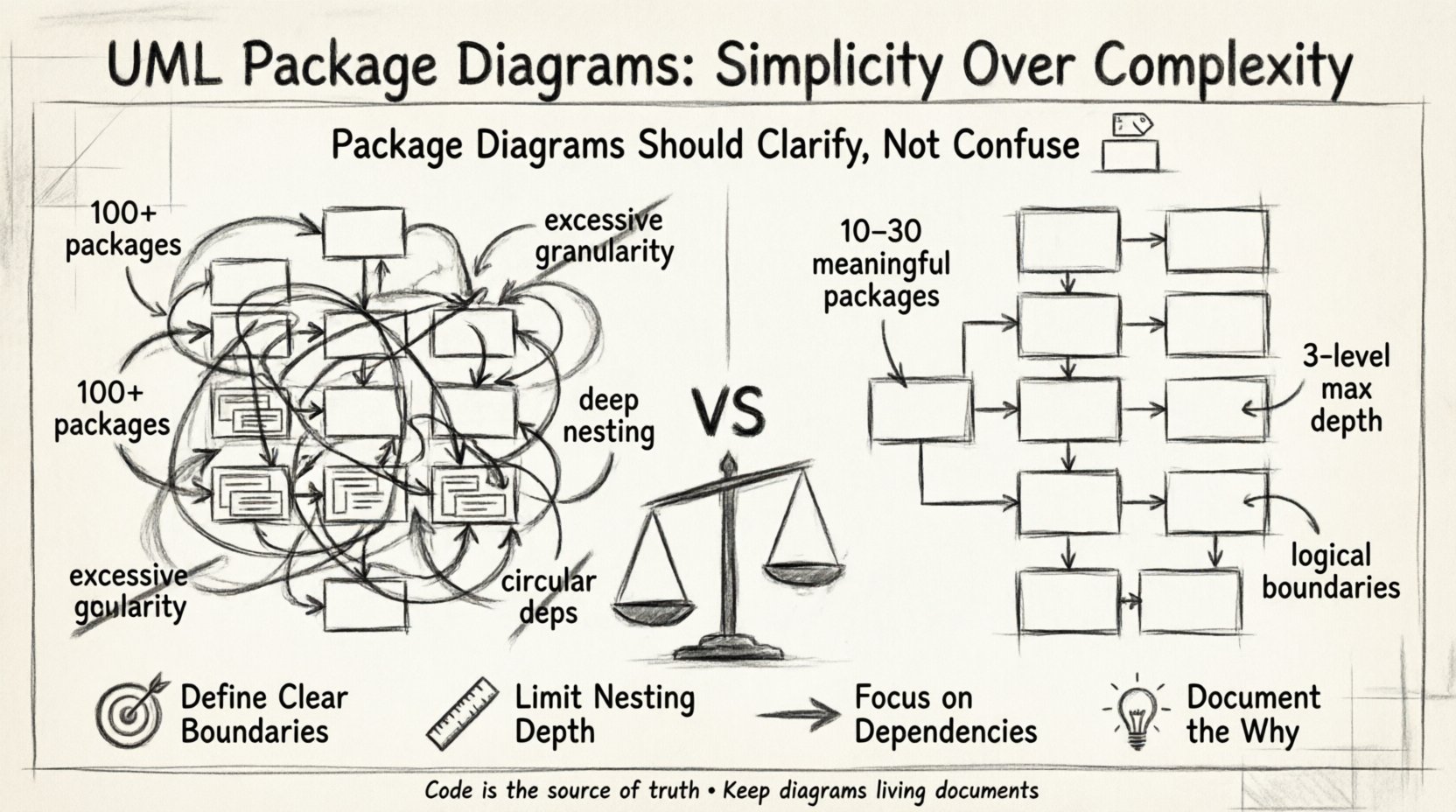
1. Excessive Granularity
One of the first indicators of over-engineering is the creation of too many packages. A well-designed system might have a few dozen packages. An over-engineered diagram might have hundreds. When a package contains only one or two classes, it suggests that the grouping logic is flawed. The package should represent a cohesive domain or a logical subsystem. If a package is just a container for convenience, it adds noise to the diagram without adding value. 🤷♂️
2. Deep Nesting Structures
Another common issue is deep nesting. This occurs when packages are placed inside other packages, which are then placed inside yet others. While namespaces can be hierarchical, deep nesting creates a maze. Navigating from the root package to a specific class requires traversing many levels. This structure often indicates that the logical boundaries of the system are not well-defined. It suggests that the architect is trying to force structure onto a system that does not naturally support it.
3. Circular Dependencies
Dependencies are the lines connecting packages. They indicate that one package requires the definitions of another. While some dependency is necessary, a high volume of circular dependencies is a red flag. This happens when Package A depends on Package B, and Package B depends on Package A. This creates a tight coupling that makes refactoring difficult. In a diagram, this looks like a tangled web of arrows. It signals that the separation of concerns has failed. 🔗
4. Redundant Relationships
Over-engineering also manifests in the repetition of information. If a dependency is shown on the package diagram, it should be supported by actual code. If the diagram shows a dependency that does not exist in the implementation, it is misleading. Conversely, if the diagram shows every single import statement as a package dependency, it is too detailed. The diagram should represent logical dependencies, not physical file imports. 📄
Why Teams Fall Into the Complexity Trap 🧠
Understanding the symptoms is useful, but understanding the cause is transformative. Why do teams create these overly complex diagrams? The reasons are often psychological and procedural rather than technical.
1. Fear of Missing Details
Architects often worry that if they leave something out, the developers will make a mistake. They feel responsible for predicting every edge case. This anxiety drives them to include more packages and more dependencies. They believe that more detail equals more safety. In reality, it creates a false sense of security. The code is the source of truth, not the diagram. 🛡️
2. Misinterpretation of Completeness
There is a misconception that a diagram must be complete to be useful. Some teams treat the diagram as a contract that must be signed off before coding begins. This leads to a “big design up front” approach where the diagram is treated as the final destination. However, software is iterative. A diagram that is too rigid becomes obsolete the moment the requirements change slightly. 🔄
3. Lack of Clear Guidelines
Many organizations lack specific modeling standards. Without a rulebook, every architect models differently. One might group by technology, while another groups by business function. This inconsistency leads to a fragmented view of the system. When guidelines are missing, individuals default to their own habits, which often lean towards over-documentation to prove their competence. 📜
The Real Cost of Complex Diagrams 💸
It is tempting to view diagrams as free artifacts. They exist on a screen and do not cost money to generate. However, they incur a hidden cost: cognitive load and maintenance time. When a diagram is over-engineered, it becomes a liability.
1. Maintenance Overhead
Maintaining a complex diagram takes time. Every time the code changes, the diagram should ideally be updated. If a diagram has hundreds of packages and thousands of dependencies, updating it becomes a chore. Developers may skip the update because it is too time-consuming. This leads to documentation drift. The diagram no longer matches the code, rendering it useless. A stale diagram is worse than no diagram at all. 📉
2. Reduced Readability
The purpose of a diagram is communication. If a stakeholder looks at the diagram and cannot understand the flow of the system, the diagram has failed. Over-engineered diagrams look like spaghetti. The eye wanders aimlessly, trying to find the main path. This confusion slows down decision-making. Onboarding new developers also becomes harder. They have to untangle the web before they can write their first line of code. 🤯
3. Hindrance to Refactoring
When the architecture is documented in a way that is too rigid, it discourages change. If a developer wants to move a class to a different package, they must update the diagram. If the diagram is a mess, they might avoid the move. This stagnation leads to technical debt. The system becomes harder to evolve because the documentation acts as a barrier to change. 🧱
Best Practices for Streamlined Modeling 📐
How do we move from complexity to clarity? There are specific strategies that help maintain a healthy balance. These practices focus on intention and utility rather than exhaustive detail.
1. Define Clear Boundaries
Start by defining the major subsystems of your application. These could be based on business domains, such as Billing, User Management, or Reporting. Create a package for each major domain. This aligns the diagram with the business logic. It ensures that the structure reflects the purpose of the software. 🎯
2. Limit Package Depth
Try to keep the nesting depth to a maximum of three levels. If you find yourself creating a fourth level, reconsider the grouping. Ask if the sub-package is truly necessary or if it is just a convenience. Often, a flat structure is more readable than a deep one. If a package is too large, split it. If it is too small, merge it. Balance is key. ⚖️
3. Focus on Dependencies, Not Implementation
Show the dependencies between packages. Do not show the classes inside them unless necessary. A dependency arrow means “Package A needs Package B to function correctly.” It does not mean “Package A calls this specific method in Package B.” Keep the focus on the interaction between groups, not the mechanics of the interaction. 🔗
4. Document the Why, Not Just the What
Use notes or comments to explain the reasoning behind a package structure. Why are these classes grouped together? What is the contract between these packages? This context helps future maintainers understand the design decisions. It turns the diagram into a guide, not just a map. 🗺️
Comparison: Over-Engineered vs. Effective Diagrams
To illustrate the difference, consider the following comparison. This table highlights the characteristics of a problematic diagram versus a well-structured one.
| Feature | Over-Engineered Diagram | Effective Diagram |
|---|---|---|
| Package Count | High (100+), often trivial | Low to Moderate (10-30), meaningful |
| Dependency Arrows | Cross-linked, circular, dense | Linear, directional, sparse |
| Update Frequency | Never, due to effort | Regular, aligned with code changes |
| Readability | Low, requires deep study | High, understandable at a glance |
| Primary Focus | Completeness and detail | Communication and structure |
| Maintainability | Difficult, brittle | Easy, flexible |
This comparison shows that the value of a diagram lies in its utility. A diagram that is easy to read and update provides more value than one that is technically perfect but impossible to maintain. 📊
When Complexity is Justified ⚖️
While simplicity is generally the goal, there are scenarios where a more complex package structure is necessary. It is important to recognize when to deviate from the rule of thumb.
1. Highly Distributed Systems
In microservices or distributed architectures, the boundaries between systems are physical as well as logical. The package diagram might need to reflect deployment units. In this case, more granularity is required to show how services interact across the network. The complexity is justified by the physical constraints of the system. 🌐
2. Enterprise-Scale Legacy Systems
Large legacy systems often have inherent complexity that cannot be ignored. If a system has been running for years, it may have accumulated many subsystems. Simplifying the diagram too much might hide critical dependencies that affect stability. In these cases, a detailed view is needed to prevent accidental breakage during maintenance. 🏛️
3. Security and Compliance Boundaries
Some industries have strict compliance requirements. The architecture must demonstrate how data flows and where sensitive information is handled. Package diagrams in these contexts may need to highlight security zones explicitly. This adds layers to the diagram that are required for auditing purposes. 🔒
Practical Steps to Simplify Your Diagrams 🛠️
If you suspect your current diagrams are over-engineered, you can take steps to clean them up. This process requires discipline and a willingness to cut content.
- Review and Audit: Look at your current packages. Ask if every package is necessary. If a package has only one class, merge it.
- Remove Redundancy: Check for duplicate dependencies. If Package A and Package B both depend on Package C, ensure this is clear without showing every single connection.
- Standardize Naming: Ensure package names follow a consistent convention. Ambiguous names lead to confusion and unnecessary clarification notes.
- Automate Where Possible: If your modeling tool allows, generate the diagram from the codebase. This ensures the diagram always matches the code. It removes the manual update burden. 🤖
- Set a Review Process: Include diagram reviews in your code review workflow. If a developer changes the architecture, they must update the diagram. This keeps the documentation fresh.
Final Thoughts on Modeling Discipline 🎓
The journey towards effective software architecture is not about finding the perfect diagram. It is about finding the right tool for the job. UML package diagrams are powerful tools for visualization. They help teams think about structure before writing code. They help stakeholders understand the scope of a project. However, they must not become an end in themselves.
Over-engineering is a natural tendency. We want to be thorough. We want to cover all bases. But in software, excessive detail often leads to paralysis. The best diagrams are those that are simple enough to understand but detailed enough to be useful. They serve the team, not the other way around. By keeping the focus on clarity and utility, you can ensure that your architecture remains a strength rather than a weakness. Keep it clean. Keep it simple. Keep it useful. ✅
Remember that the code is the ultimate documentation. The diagram is a helper. Do not let the helper overshadow the master. Focus on the logic, the flow, and the boundaries. Let the structure emerge from the requirements, not from the desire to document. This approach leads to systems that are easier to build, easier to maintain, and easier to understand. 🚀